Slideshows are cool, but does it really help your website monetize better?
According to a marketing optimization expert Wide Funnel, image sliders are a poor way of presenting home page content.
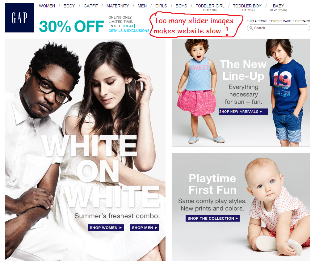
I’m sure you’ve noticed that certain websites especially online stores tend to have image sliders or rotating sliders as some might call it, which usually shows promotions non-stop.
Sure it makes your website awesome-looking but to some people, they are really annoying.
Here are some problems with current-day image sliders:
1) Irrelevant messages
The most annoying part for people when they arrive at your website is getting irrelevant promotions.
Small banners at the sides of your main article promoting different irrelevant products are already annoying enough, so just imagine how would it affect your visitors if you use the bigger front page image sliders?
If your website is about hotel packages in your area but your image slider promotion is about Japan restaurant membership, how many people would even click on that?
2) Image sliding too fast
Doesn’t it irritate you that as you read, images slide constantly?
Although readers are focusing something else, our eyes still see the parts that we do not focus.
For example, when you’re eating an apple in the garden, you look at the apple as you bite it. BUT did you realize that you indirectly still view the grass and the blue sky?
You probably wouldn’t notice but if the sky suddenly changes color in a blink of an eye, you will notice it and the same applies for your website.
3) Image slider banner takes up the whole page
The reason people visit your website in the first place is for more information, not more promotion.
If they arrive at your website and their whole screen is filled with image sliders, they will feel annoyed at the thought of scrolling down in order to see the real information.
Here’ something to bear in mind – is your promotion more important than your real content?
Others who also disagree with rotating images
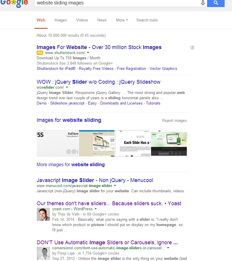
I am not alone in this opinion, because if you type in “Website sliding images” in Google, you will find many other website optimization experts disagreeing with the use of it.
As you can see from my print screen, Yoast and Conversion XL which are also on the front page and both of them disagrees as well.
Conclusion
Image sliders do make your website look awesome, yes, but they also have a tendency to annoy visitors and that is something you should stay away from.
But if you still would like to use image sliders, you can by reducing the image slider space to only a quarter of your page, increasing the scrolling time to let others read, as well as making it relevant to your content.
For more information on boosting website conversions, check out my review of Wealthy Affiliate here.
Riaz


