If you’ve been wanting to create a mobile-friendly website, then WordPress is the way to go!
Unlike many CMSs out there, WordPress actually has a built in software which automatically adjusts your theme to suit mobiles.
They make sure that is it a requirement for any WordPress theme builders to add flexibility in order for websites to change forms when seen on the phone.
This means that when you google something, that website will look different on phone compared to when you surfed it on your desktop.
But the question is, does it actually look good on the phone? How well do they adapt your website? How is the user going to navigate?
To understand that, let’s take a closer look at…
How WordPress looks on the phone
For the purpose of this experiment, let’s try out this very website that you are looking at (MyInternetQuest.com) as it is a WordPress website not to mention the fact that we can avoid copyright issues if we were to use other websites.
Now let’s take a look according to these few criteria:
1) Availability in Google Search
Some CMS do not have an automatic adjustment system within its software like how WordPress does.
So because of that, the website might be very hard to find through phone.
As seen from the picture, we can know that WordPress has also set up the Search Engine Optimization for phone usage,
The writings come our perfectly and it’s at the top of the search bar too, well done WordPress!
2) Home page adjustments
A website is of course very different when seen through a mobile phone compared to a computer desktop.
And as seen from the picture above, the desktop view of the website home page is very wide and big which definitely wouldn’t fit in a small phone view.
So how would WordPress adjust this home page to suit the screen of a mobile phone?
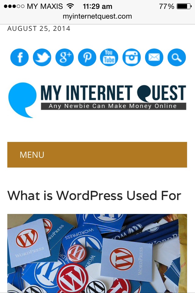
As seen from the picture on the right, WordPress does adjust the home page to make it look nice and sweet without anything missing, très bien! (It means very good in French).
3) Page navigation
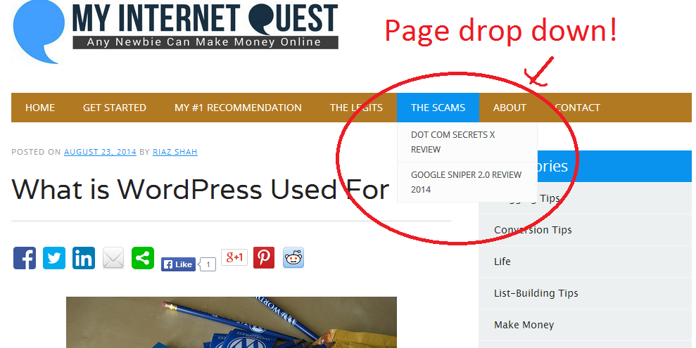
Now comes the complicated part, how does WordPress adjust the page navigation on a phone?
As seen from the picture above, the page bar ranging from “Home” to “Contact” is extremely wide compared to a phone’s screen which is obviously vertically long.
Take a look at the picture below which is the mobile version.
As you can see, the mobile version is very much optimized for user experience.
In fact, the phone appearance looks more organized that the one on the website because everything can be accessed just by clicking the “Menu” button which in fact, saves more space than we thought.
And the cool part, is that I didn’t even need to do anything as WordPress handles everything.
Conclusion
We live in a mobile World today with almost everyone in the World checking out their phone almost every free time they have, especially when they’re stuck in traffic.
The potential for the mobile market is so huge that 78% of retailers are planning to invest in mobile to keep up with the current competition.
Therefore if you are doing any sort of business especially online, it would be a very smart move to start focusing your attention to the mobile market.
Feel free to share your comments below as I’ll be more than happy to reply.
For more information on optimizing your online business, do check out my review of Wealthy Affiliate here.


